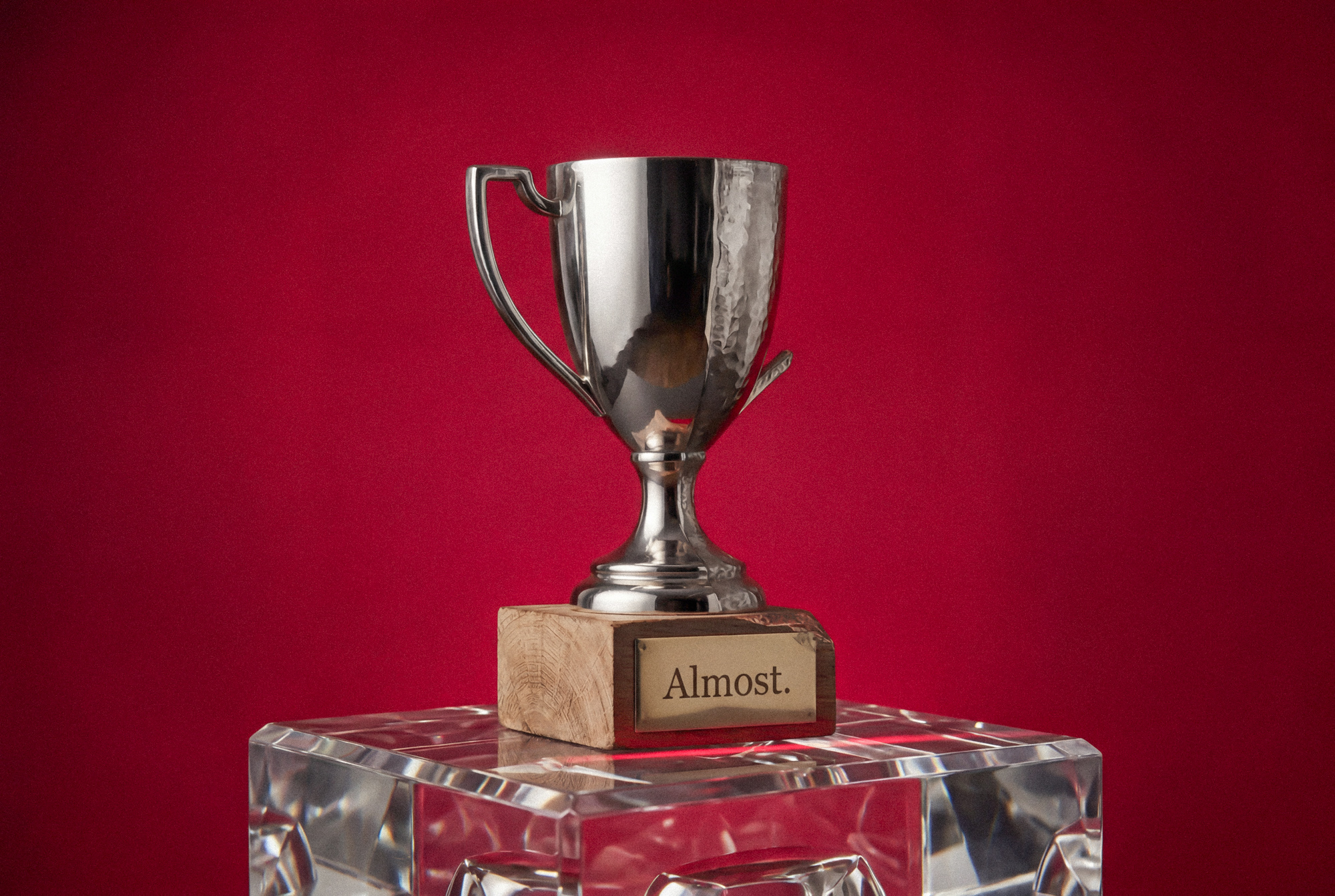
The Day the Logo Saved the Company (Just kidding, It Didn’t.)
A founder walks into Baha Club convinced their logo is the reason growth has stalled. It isn’t. The real problem is deeper: fractured messaging, unclear positioning, and a brand story that contradicts itself at every turn. This post unpacks why visual identity can’t compensate for strategic confusion and why clarity, not cosmetics, is what actually drives momentum.

Last spring, a founder walked into our studio holding a printout of their logo like it was a medical scan. They placed it on the table gently, the way you would set down something fragile and deeply disappointing. “This,” they said, tapping the page, “is why we’re not growing.”
It was a perfectly fine logo. Clean. Modern. Inoffensive in the way hotel art is inoffensive.
We nodded thoughtfully, the way professionals do when they know the conversation is about to get awkward.
They explained that sales were flat. Their team was confused about positioning. Customers weren’t quite sure what made them different. The website messaging felt “off.” But the logo, they were sure, was the root of the problem. If we could just sharpen it. Modernize it. Make it pop.
We’ve learned that when someone says “make it pop,” what they really mean is “I’m uncomfortable with the complexity of this situation.”
So we asked a question that tends to ruin the fantasy: “If we changed nothing but the logo, what would be different?”
Silence. A long one.
Branding has a reputation problem. It’s often treated like a surface-level upgrade. New colors. New typeface. Something geometric and vaguely Scandinavian. But a brand is not a haircut. It’s not a seasonal jacket. It’s the architecture underneath your business decisions.
The real issue wasn’t their mark. It was their message. They were trying to serve three audiences with one offer. Their pricing suggested premium, their copy suggested discount, and their social presence suggested they had recently discovered Canva.
No logo survives that.
Over the next few weeks, we dismantled things. Gently, but thoroughly. We clarified who they were for and who they were not for. We sharpened their positioning until it had edges. We stripped away language that sounded impressive but meant nothing. The logo barely changed. We adjusted proportion, refined typography, made it more intentional.
When they launched, growth followed. Not because the icon was rounder. Not because the color was trend-aligned. But because everything finally told the same story.
The logo did not save the company. The clarity did.
But we did give the logo a better haircut. We’re not monsters.

Lorem ipsum dolor sit amet, consectetur adipiscing elit. Suspendisse varius enim in eros elementum tristique. Duis cursus, mi quis viverra ornare, eros dolor interdum nulla, ut commodo diam libero vitae erat. Aenean fau
Lastest Ramblings
Lorem ipsum dolor sit amet, consectetur adipiscing elit. Suspendisse varius enim in eros elementum tristique. Duis cursus, mi quis viverra


Let's


Talk
Ready to stop blending in? Reach out and we’ll show you what it looks like when strategy meets style. Let’s talk and see if we’re the right fit.